 “Pantone’s 2018 color of the year is Ultra Violet, a color the company says communicates originality, ingenuity and visionary thinking. Pantone
Pantone is recognized as a color authority, and is responsible for setting standards for color representation across many industries. These standards help designers, publishers, printers and consumer products manufacturers ensure their colors are consistent — every time — regardless of the surface they’re being printed on or the materials being used.
One way Pantone establishes itself as an influencer is by naming its annual color of the year. Pantone’s 2018 color of the year is Ultra Violet. Color of the year also is a fun and accessible way for consumers — those who don’t work in design or industrial fields — to become familiar with the brand. To those people, it might be just another color, but it’s clear that Pantone has high expectations for its annual select shade.
How Color of the Year Is Chosen
The Pantone Color Institute is an in-house consultancy that forecasts design trends and advises companies how best to use color to connect with customers. Laurie Pressman, vice president of the Pantone Color Institute, gave us insight into how the company chooses the color of the year and why it’s become so influential.
"To select the color of the year, the global team of experts at the Pantone Color Institute combs the world looking for new color influences across all industries," Pressman says via email. "We look at activities in the entertainment industry, art collections, fashion runways and key materials tradeshows, all areas of design, popular travel destinations, socio-economic conditions and so much more. Influences are varied, but they all tie back into the cultural zeitgeist and where we are in a particular moment in time."
According to Pantone, Ultra Violet "communicates originality, ingenuity and visionary thinking." They chose the color because of its influence on visionaries such as Prince, Andy Warhol and Frank Lloyd Wright. But, Pantone prefers consumers not reflect so much on how it chose Ultra Violet; instead it wants people to use the color as a way to move forward. And according to Pantone, this philosophy works.
Purple and Politics
Though Pantone stops short of being overtly political, it’s hard not to read between the lines of Pantone’s florid verbiage and look for political subtext in something so seemingly innocent. Blue and red (the colors of the Democratic and Republican parties) are natural opposites and the combination of the two does yield purple. A bright and pretty purple might not make anyone feel better about the divides between political classes, but it could inspire a moment or two of reflection. Who can forget Bill and Hillary Clinton wearing purple to her 2017 concession speech? In Clinton’s memoir, "What Happened" she admits she wore purple as "a nod to bipartisanship."
Leatrice Eiseman, executive director of the Pantone Color Institute told The New York Times, Ultra Violet "communicates originality, ingenuity and visionary thinking … It’s also the most complex of all colors because it takes two shades that are seemingly diametrically opposed — blue and red — and brings them together to create something new."
Eiseman also says it was time for a color that could help take awareness and potential to a higher level, and Ultra Violet does that by suggesting "the mysteries of the cosmos, the intrigue of what lies ahead, and the discoveries beyond where we are now."
Influencing Fashion and Beauty
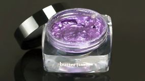
That might sound like a lot of fluff, but Pantone’s color of the year is very influential in certain circles, especially fashion and beauty. One company Pantone partners with is Butter London, which is currently the exclusive beauty partner for Ultra Violet, and features a collection of nail polishes, lip glosses and eye shadows. In 2016, Butter London also offered a collection of Pantone’s 2017 color of the year Greenery.
 “Butter London is the exclusive cosmetics partner for Ultra Violet, and features a collection of nail polishes, lip glosses and eye shadows in the shade.Butter London
"We have been collaborating with Pantone for the past two years," Vanessa Paparella, associate PR and influencer manager for Butter London, says via email. "We began development on the color of the year 2018 collection in May 2017, seven months prior to the official Pantone color of the year 2018 announcement." That timeline ensured Butter London’s products were in stores to coincide with Ultra Violet’s unveiling.
Beauty retailer Sephora also works with Pantone, and Pantone’s own website curates a selection of products from other retailers, including jewelry, clothing and even sporting goods.
So far, Ultra Violet has proven to be a popular choice, and Butter London’s Paparella says sales have been strong. Pantone, however, doesn’t want consumers to necessarily dwell on previous colors.
"Looking back at past colors of the year, there hasn’t been a clear ‘favorite’ as each is supposed to reflect a particular moment in time, not compete with one another," Pressman says. "However, over the past several years we have seen a surge in attention around the color of the year in general, as our selections have come to mean so much more than ‘what’s trending.’ The Pantone color of the year represents a strategic direction for design; a reflection of the cultural zeitgeist."
Now That’s Interesting
The Pantone system was founded in 1963 by a chemist named Lawrence Hebert, who wanted to standardize the formula used to produce every possible color. The word Pantone itself means "all colors" (broken down into "pan" and "tone").


